

Is Designing A Travel App Worth It
Travel experience is rarely lukewarm. It's either excellent, or poor. Nowadays, many travelers rely heavily on mobile apps to organize their voyages, which can mean two things.
1) The experiences are likely to have been influenced by travel apps
2) Users will form their opinion of the app based on their travel experience — be it good, or bad.
In order to make sure your travel app creates the ultimate user experience, and thus helps create the ultimate travel experience, app professionals need to focus on four key elements.
1) Transparency
2) Minimalism
3) Search engine
4) Speed and agility
Let's take a look at each of these elements, and how they can help create the ultimate travel app mobile UX.
1. Transparency
One of the things travelers, both frequent and occasional, despise the most are hidden fees. If there's one thing that can completely destroy the experience users have with your app, it's the unpleasant surprise of additional expenses, once they have already reached their destination.
Hidden fees aren't that uncommon, either. They can happen with tourist taxes, overweight baggage, WiFi, rental insurance, parking, and so on.
Communicating as clearly and transparently as possible about ALL expenses will save travelers a lot of headaches and bolster your app's user experience. Try to make this communication as concise, yet thorough, as feasible.
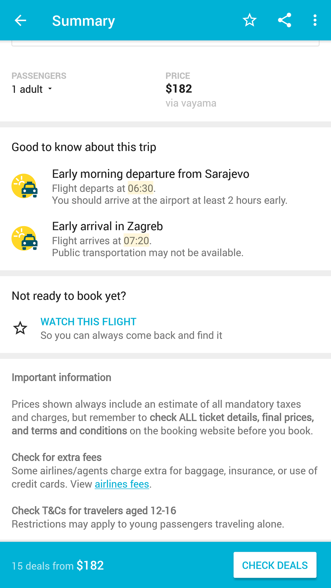
Hopper, as we can see in the screenshot above, states it very clearly that the prices shown in the app always include an "estimate of all mandatory taxes and charges", reminding its users to "check ALL ticket details, final prices, terms and conditions". It is a clear and concise way of noticing users that extra fees might occur, saving them unpleasant surprises and unexpected expenses that they might connect back to your app.
By being transparent and communicating clearly, the app does a great job at building trust with its users. This approach is essential for success, especially when money is involved. Lack of transparency can lead to bad reviews, low ratings, and a higher number of uninstalls. Consequently, it will become even harder to bring in new users and retain existing ones.
2. Minimalism
The key thing to remember when building a travel app is that your users are extremely demanding. They're using a display with very limited real estate, they're pretty much always on the go, and in that ungrateful environment, they're looking for a solution to a problem, fast.
For a travel app, the problem could be booking a flight, finding accommodation, or even making reservations for a table in a restaurant. The solution is, or at least should be, in the app. Remember, they want the solution fast, so cut to the chase quickly.
Take a look at these three examples below.
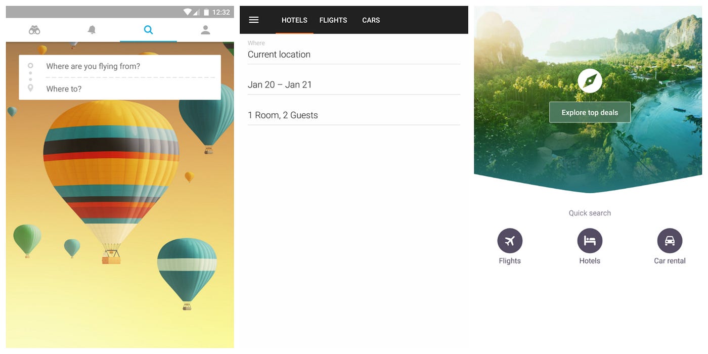
From left to right Hopper, Kayak, and Skyscanner, considered among the top travel apps out there. These three screenshots show each app's first screen.
Notice that they all have something in common: they are all very minimalist in design. The apps make very good use of their limited screen real estate and white space. There's absolutely nothing on there that can draw the user's attention away from solving their problem.
The second thing you'll notice is a need for speed. All apps are looking to solve their users' problems as fast as possible. Everything you need from a travel app is right there, on the first screen. Fast, accessible, simple, and effective.
A minimalist interface, one that offers solutions as soon as the users turn the app on, is essential for a good travel app UX.
3. A Quality Search Engine
Even though there are ways apps can anticipate what their users want from the get-go, and can offer solutions to engage (more on that below), sometimes a little "effort" from the users' side is necessary. Apps are still not mind readers.
However, a good travel app will make that user effort as minimal as possible. A quality search engine plays a crucial part in achieving that goal.
There are four important elements to consider when building a search engine for a travel app.
- The results (obviously) must be spot on
- The search bar must be clearly visible and fast, simple to access
- Search results should present in an appealing way
- Personalization is fundamental
The first goes without saying, but we'll invest a few words anyway. Search results must be extremely precise. The engine must be able to spot typos, to finish queries mid-sentence, and to offer quality search results regardless of the keyword order. Aim for accuracy along with speed.
The second element can easily be linked to the above mentioned topic of a clean interface. The search engine must be clearly visible, and simple to access. Let's scroll back up for a moment and take another look at the screenshots. Two out of three have large, easily accessible search bars. Now, if you were looking to find a place to stay — fast — which of the three above do you think would be the best solution? Clearly not the one whose search engine is hidden amongst other UI elements.
For the third element, how to present search results, you would first need a deeper analysis of your target audience and what they prefer. It's hard to guess which approach works best without deeper analysis of the target audience. Instead, we'd advise you to A/B test your app, utilize a mix of quantitative and qualitative data to validate your tests, and build from there.
Looking at Skyscanner and Kayak for instance, we see two different approaches. While Skyscanner offers large images with just the most basic info at glance, Kayak offers smaller thumbnails, which in turn allows it to show more results on a single screen. Again, we can't judge which approach works better, but your audience definitely can depending on their experience preferences.

The fourth element works wonders for the overall user experience — personalization. It's so powerful, we were even tempted to devote an entire paragraph just to this concept. Being able to offer compelling, personalized suggestions is something many users want, especially when it comes to travel.
Many travelers move around the globe for the experience. They want to see new and exciting places, visit new people and learn about different cultures. They have this innate wanderlust that apps can tap into to provide a better experience.
By offering personalized search suggestions, based on actual visit history, search history, location and other variables, travel apps can further fuel this wanderlust and encourage users to book experiences they might have not thought to seek out on their own.
The search engine is one of the fundamental ways users interact with the app. Failing to properly address every aspect of the search engine might result in a poor user experience, and that will probably make users look for solutions elsewhere.
4. A Seamless Booking Process
"The average shopping cart abandonment rate falls around 68 percent, but for mobile it is a distressing 97 percent. Meaning, out of 100 filled carts, only three will turn into sales."
This is a quote from Ventureburn, published exactly a year ago, highlighting the importance of having a well-crafted mobile cart/booking screen. Let's not lose our grip on what's important, and take a look at the bigger picture for a moment.
As we noted, users want solutions to their problems, and they want them fast and easy. There can be plenty of reasons why users would leave just before completing a transaction. Maybe there were hidden fees that only showed up right before the purchase? Maybe there weren't enough payment options? Maybe there was a bug with the payment system, which can often scare people, thinking they might get charged twice?
Looking at the screenshot, it's easy to spot a problem. There are only a handful of payment options, and limiting users in such a way can have them trying out a different a different app. After all, it's easier to download a new app, than setting up an entirely new payment method.
To have an awesome travel app UX, the entire user's journey needs to be accounted for, from the very first screen until the purchase is complete. Offer one price on the search result screen, and another on the purchase screen, and your UX goes down the drain. Exclude PayPal, or a certain type of credit cards from payment methods, and people will leave. Payment must be fast, seamless, secure and in line with what was advertised elsewhere in the app.
Pro Tip: Qualitative Analytics
All the tips seem fine on paper, but execution can be a bit tricky. That's why every change needs to be tracked, analyzed, and if necessary, tweaked (accurately). If the changes don't result in any tangible progress, you might want to analyze them and see if there's any elements that need improving. You can use qualitative analytics tools, like Appsee, to analyze the user experience.
What is qualitative analytics? Unlike its quantitative counterpart, which revolves around numbers and anything that can be quantified (download numbers, session length, etc.) qualitative analytics essentially analyzes the quality of the experience users have with an app. For example, quantitative analytics can tell you 10 percent of your users uninstalled the app this month, but qualitative analytics that will tell you that users encounter a persistent bug on the login screen that prevents them from logging in via Facebook.
The key benefits of qualitative analytics is that it helps you understand your app's usability and identify any pain points in the UX. You can achieve that by monitoring the intuitiveness of your app's gestures via aggregate touch heatmaps for example. Or, by examining user session recordings to see if all of the app's features are frictionless and simple to use for your users. On top of that, you can watch user session recordings to analyze your user onboarding process and check to see if the app is being used the way it was intended, in the first place.
In terms of functionality and performance, qualitative analytics enables you to track and visualize glitches, crashes and freezes, which can help you recreate the scenario in which the app misbehaved, quickly and easily.
Qualitative analytics will help you make the most informed decisions of existing and future app features, which will help bolster your overall user experience and retention.
Final Thoughts
A good travel app user experience revolves around speed and efficiency. A clean interface, a solid search engine with a healthy dose of personalization, transparency and a wide array of brick-solid payment methods will set you and your users up nicely.
However, keep one thing in mind: apps are getting better and users are getting more demanding. Trends shift fast. Whatever you decide to do — don't stop there. Always keep analyzing your app, all of its features and elements. Keeping track of how your app behaves in the wild is the best way to ensure it always, absolutely always, delivers user experience worthy of the top of the charts.
Is Designing A Travel App Worth It
Source: https://uxplanet.org/what-makes-a-good-travel-app-ux-1e261711b045
Posted by: cabreraaltatter.blogspot.com
0 Response to "Is Designing A Travel App Worth It"
Post a Comment